Welcome to my online graphic design portfolio! Thank you for taking the time to view my work, I hope you enjoy. 😀
For a downloadable version: Click Here


Digital Media
Catalyst Agents
Graphic designer, Brand designer
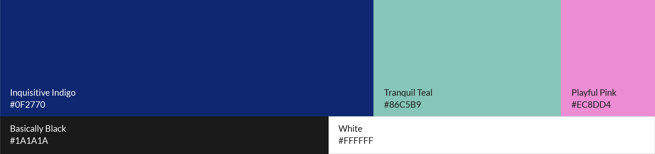
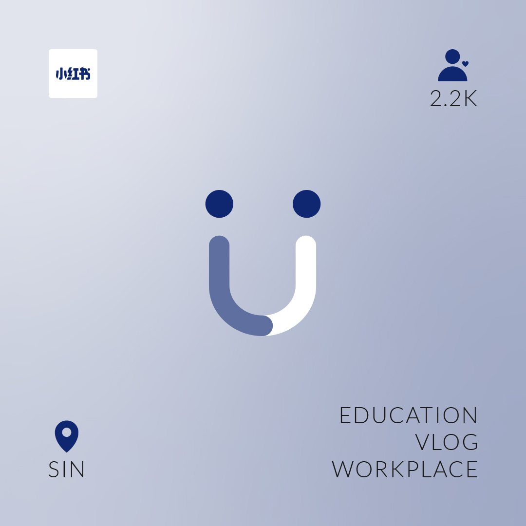
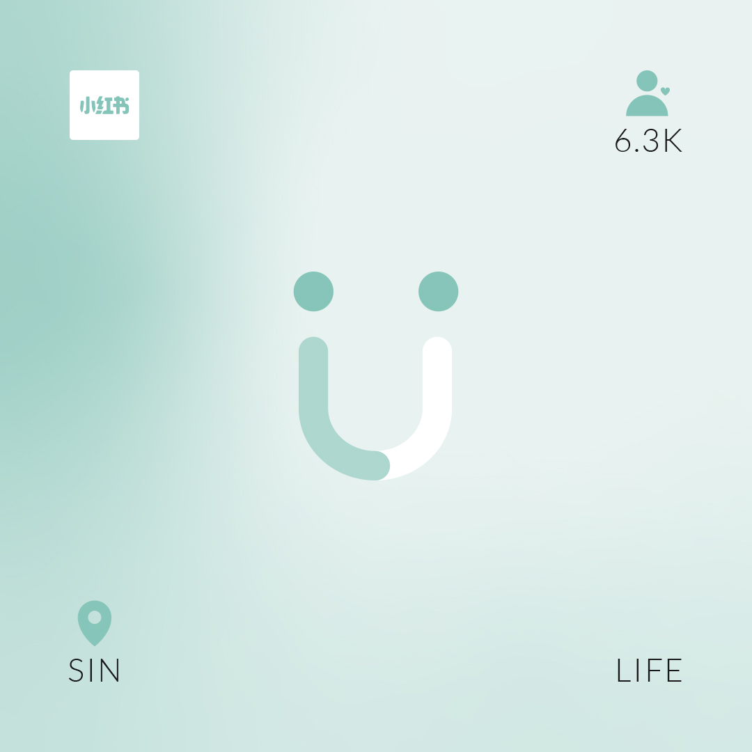
Hey-U is an online platform that was created to connect North American marketing managers asian influencers. This would allow marketing managers to bypass the time consuming task of having to search through different social media platforms for the perfect influencer. For this brand design, I wanted to make the logo playful since the name sounded fun and casual. In addition when working with influencers, typically the campaigns are meant to be entertaining to attract viewers. Therefore I used the U to represent a smile. The rounded curved path is meant to represent the journey we take you through to find the right influencer(s) for your project. The colours used were reminiscent of the 90s and early 2000s. This adding a youthful touch from the current Y2K fashion trending today.


Version #1
Version #2
Final Version
Nano influencer card
Micro influencer card
Macro influencer card
Print Advertisement
Aviary Living
Graphic designer
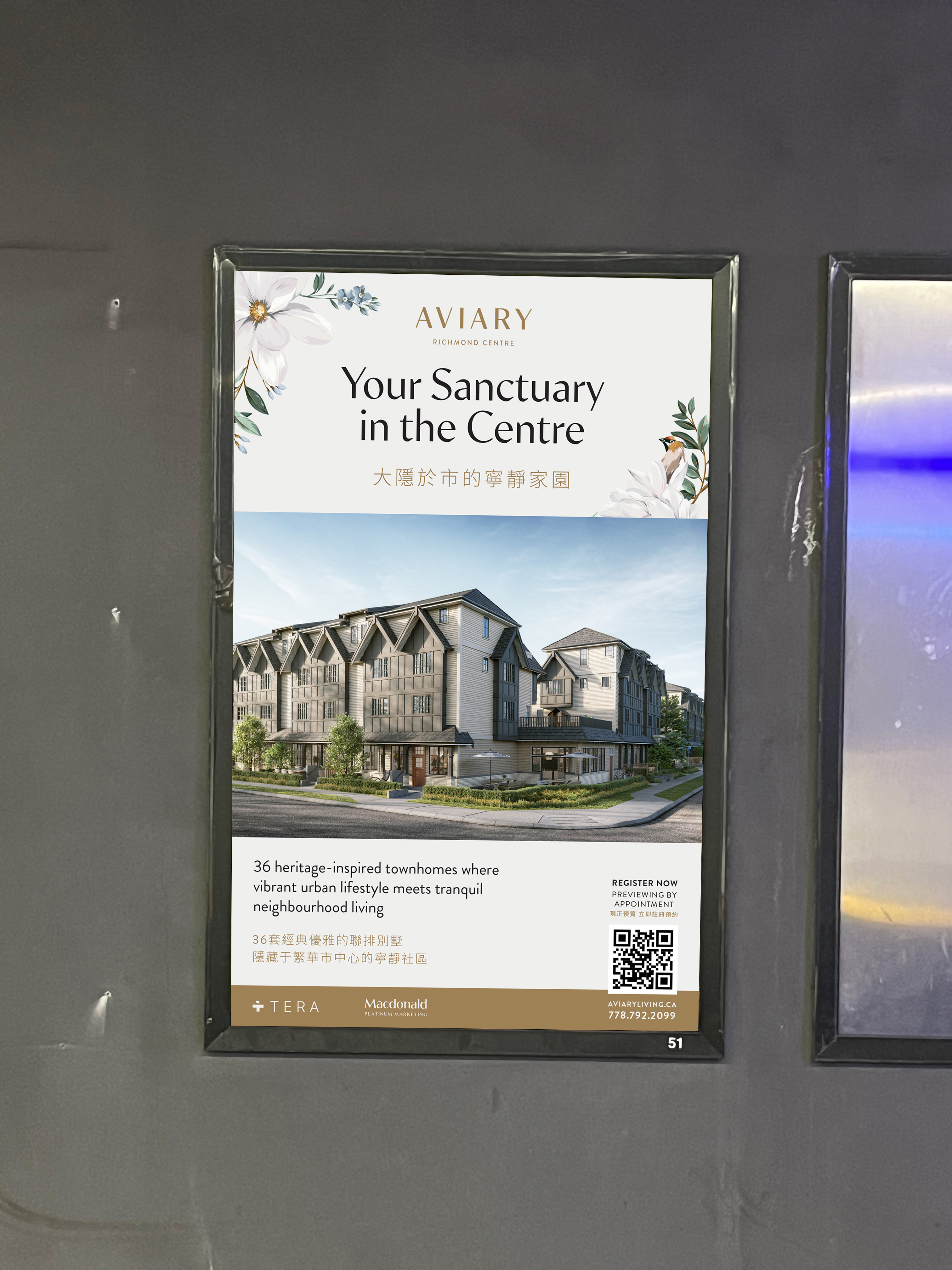
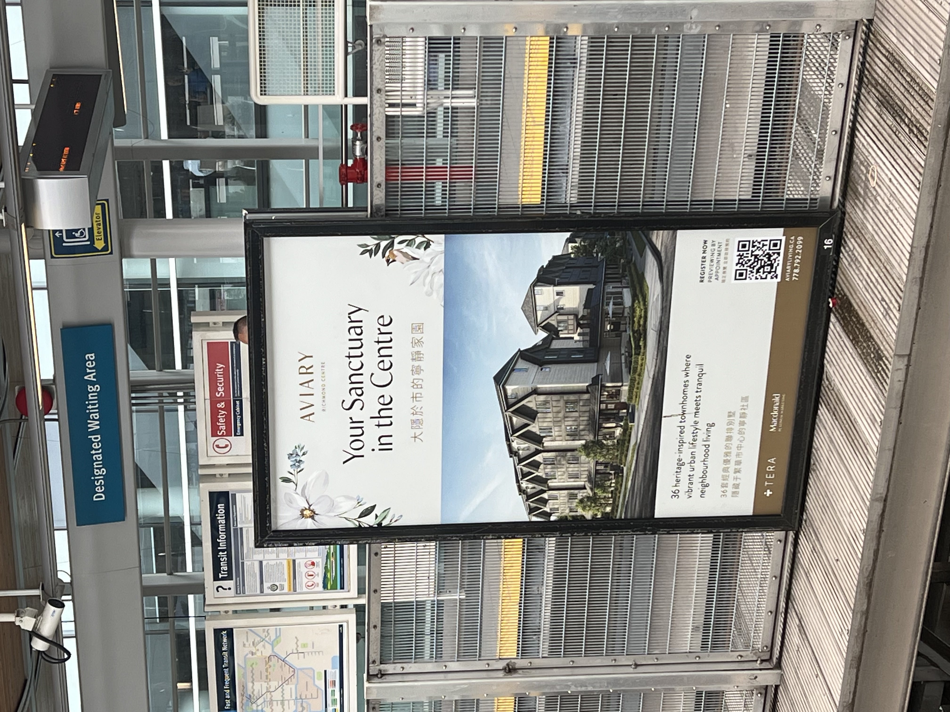
I was tasked to design a skytrain ad that would be printed and posted at various Canada Line stations in Vancouver and Richmond. When designing this ad, one challenge that I encountered was how to fit all the text while still keeping it clean and legible. After discussing with the client, we decided that the chinese copy would act as the secondary text and the english as the primary. Therefore, I used a smaller font size and their brand gold colour so in comparison it would appear less saturated than the english translations.
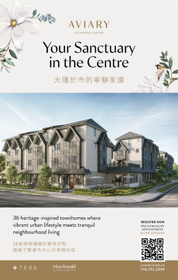
Digital design of the ad.
Mockup of ad in underground skytrain station.
Actual ad at a Canada Line station.

Social Media Videos
BCLIQUOR
Graphic designer
When doing work for BCLIQUOR, a repeated task was to create weekly Instagram reels based on articles from their TASTE magazine. There were two main types of reels created; one showcasing paired dishes and alcohol, the second being education pieces about different types of alcohol. Since the pairing reels appeared frequent, I created a consistant style of video to to highlight the dish and its respective beverage. For the education pieces, I wanted to try different styles to keep peoples engaged while watching the videos.
Please see below examples of reels I created. For more reels, check out BCLIQUOR's Instagram page.
Pairing hot dog recipes & alcohol reel.
Education piece on wine types.
Pairing BBQ recipes & alcohol reel.
Education piece on alcohol companies and their sustainability practises.
Print Media
Freelance employer
Graphic designer
In this project, I was asked to create a textbook cover. Since the topic pertained to conveyancing in British Columbia, and the course was taught at a local university in Vancouver, I chose to use Vancouver and BC as the theme. I also wanted to feature different types of heritage buildings, houses, or apartments you may come across in Vancouver. These include the Marine building and the classic Vancouver special houses. In addition while also showing highlights of BC such as the mountains, forest, and ocean. I created the back to feature a nightscape to add contrast and showcase how to city feels in day versus night.
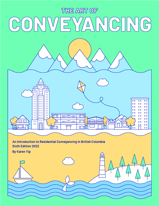
Art of Conveyancing front cover
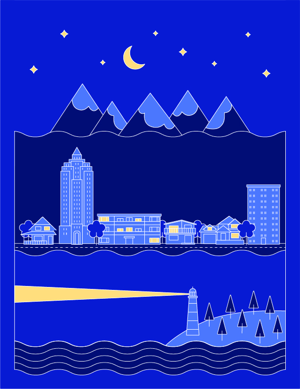
Back cover
Digital Illustration
Pendulum Magazine
Graphic designer, Illustrator
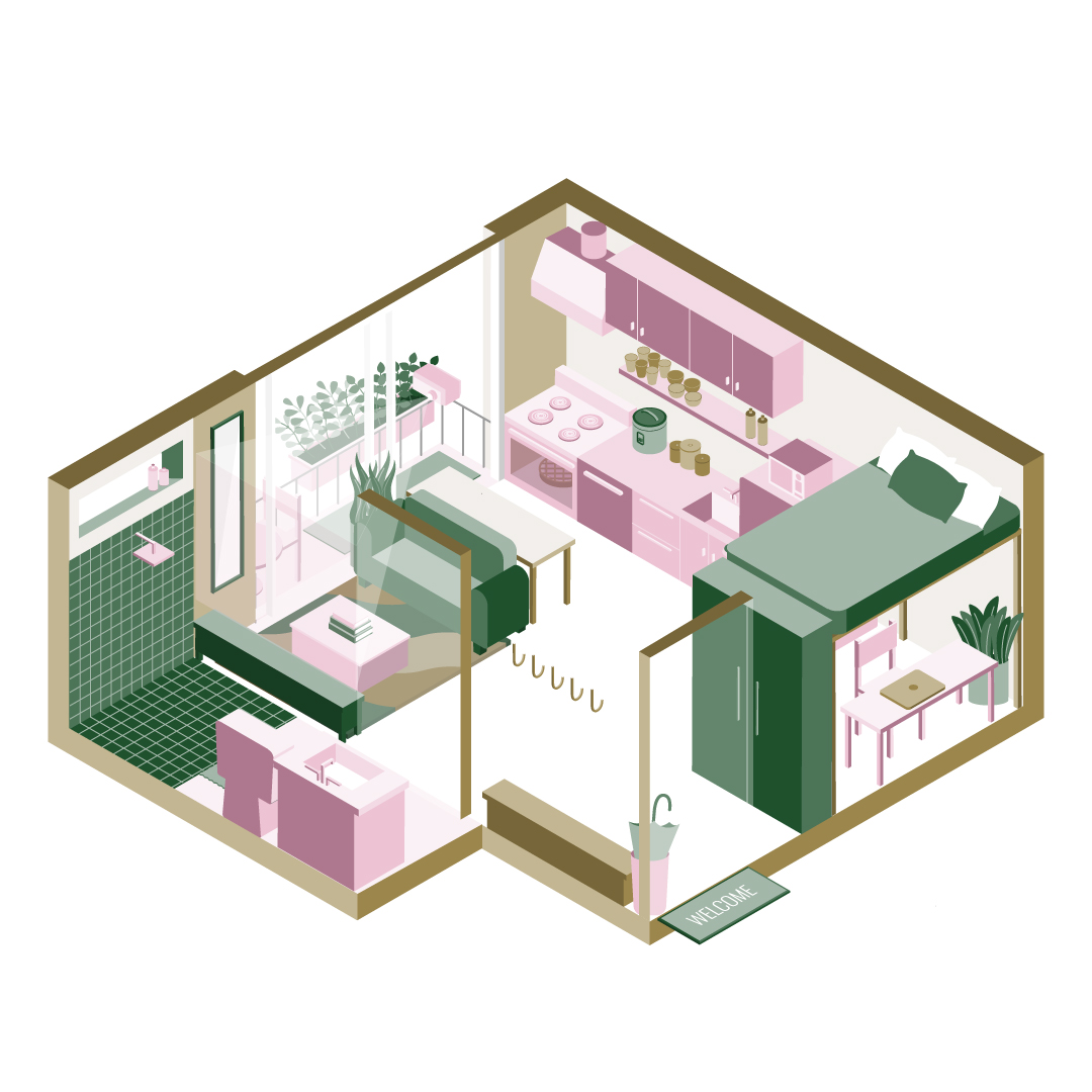
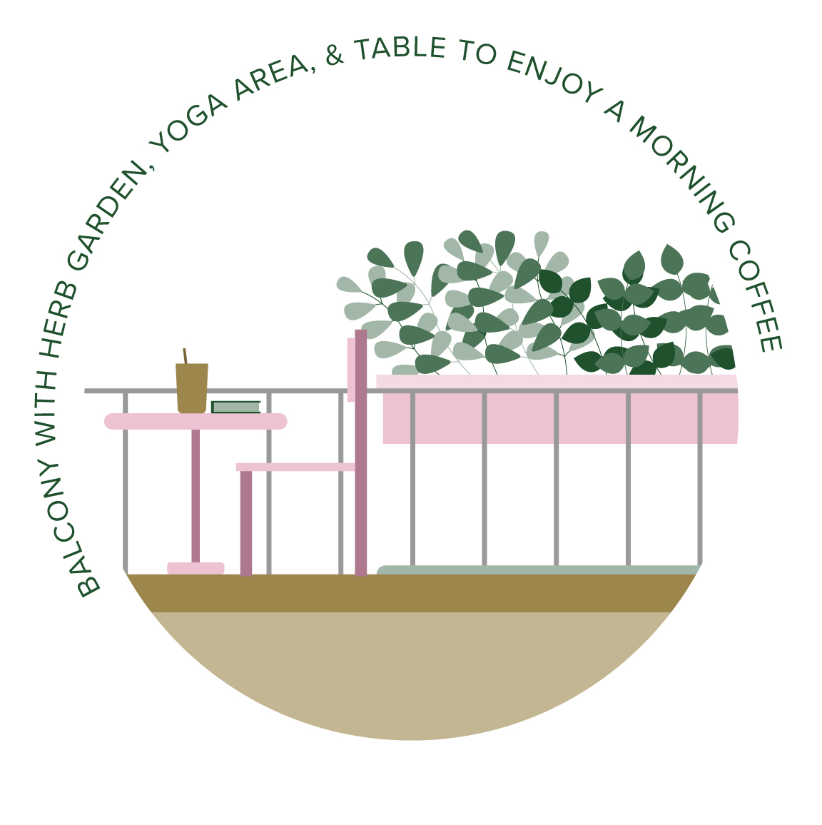
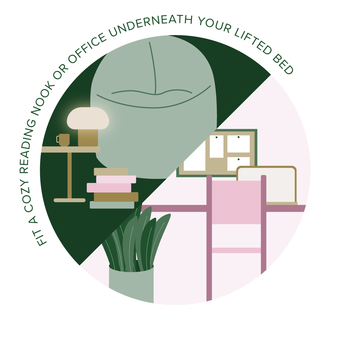
For this project, I was tasked with creating a digital illustration of what an apartment layout may look like in Vancouver. Apartments come in all shapes and sizes, many of them being on the smaller size. With smaller apartments arising with larger price tags, I designed a layout featuring how people may want to maximize their homes. With the help from my coworkers who had experience living in both Vancouver and Hong Kong apartments, we ideated up ways people can maximise their space and enjoyment of their apartments.
Digital Media
Pendulum Magazine
Graphic designer, Illustrator
One goal I had was to learn how to create videos and learn simple animation. When my boss asked me to create travel videos of her trips to Portugal and Japan, I jumped into learning how to use Adobe After Effects to create each video. Since both trips had various stops, I wanted to create videos that took the viewer along for the road trip. I added highlight icons with short animated clips of the destination prior to transitioning into the real video clip. These videos helped me understand After Effects and how to utilize it to transition between clips and add small animations.
Lisbon

Sintra

Fatima

Nazares
Coimbra
Costa Nova

Aveiro
Porto
Tokyo: Mayashita Park

Kamakura: Great Buddha of Kamakura
Kyoto: Fushikimi Inari Shrine

Uji: Byodoin Temple
Osaka: Kuromon Market

Nara: Nara Park

Kobe: Harbourland
Digital Media
Landmark on Robson
Graphic designer
In this project, I was asked to create a digital advertisement of Landmark on Robson to be displayed on a large LED screen at the Richmond Night Market. Similarly to the Aviary skytrain ad, it was a fun challenge to figure out how to incorporate all the text while maximising the building rendering. Like many ads, since most people do not typically spend much time looking at it, I wanted the main focus to be on the rendering and the slogan “There is only one Robson".
Digital design of the ad.
Ad mockups on entrance screen.
Digital Media
Catalyst Agents
Graphic designer, Illustrator
A creative project that I was tasked with was to ideate and create character illustrations of myself and my coworkers at Catalyst Agents.
For each team member, I designed a standing version and a desk version. These characters were used to introduce the team to our Instagram and occasionally in educational posts.
One challenge I had with this project was how to show differentiation between characters with similar hair styles as all the faces were the same style. I decided to customize them further and have each character wear clothes that I typically noticed them wearing at the office. This allowed for personalization and helped showcase the individuals uniqueness more.
Character at their desk.
Character at their desk.

A four slide carousel for the holidays.
Digital Media
Catalyst Agents
Graphic designer, Illustrator
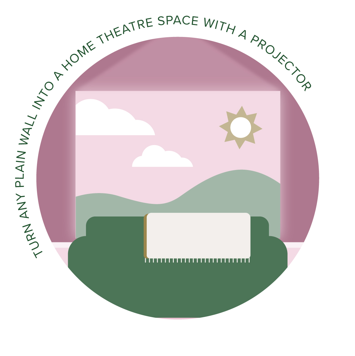
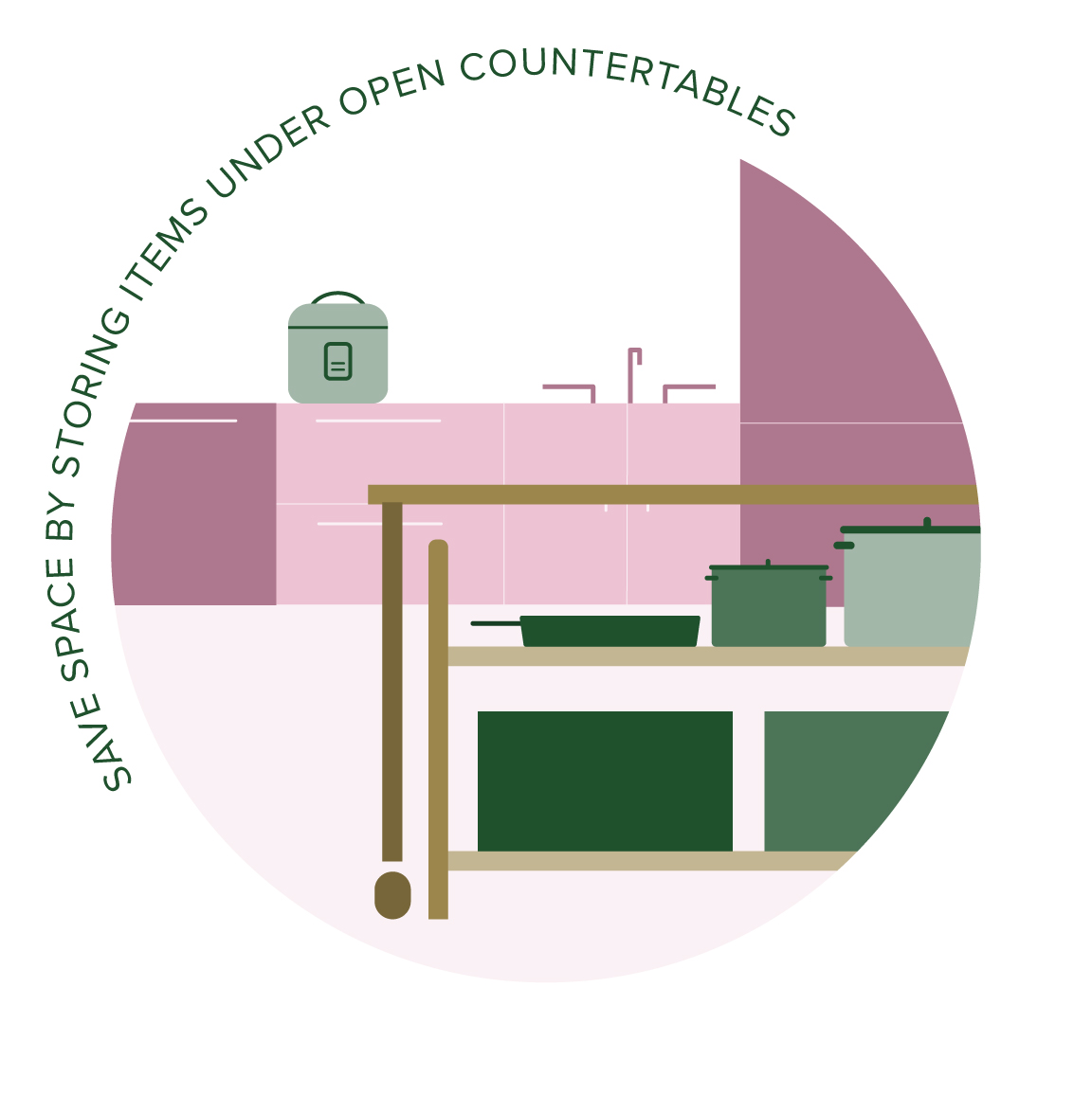
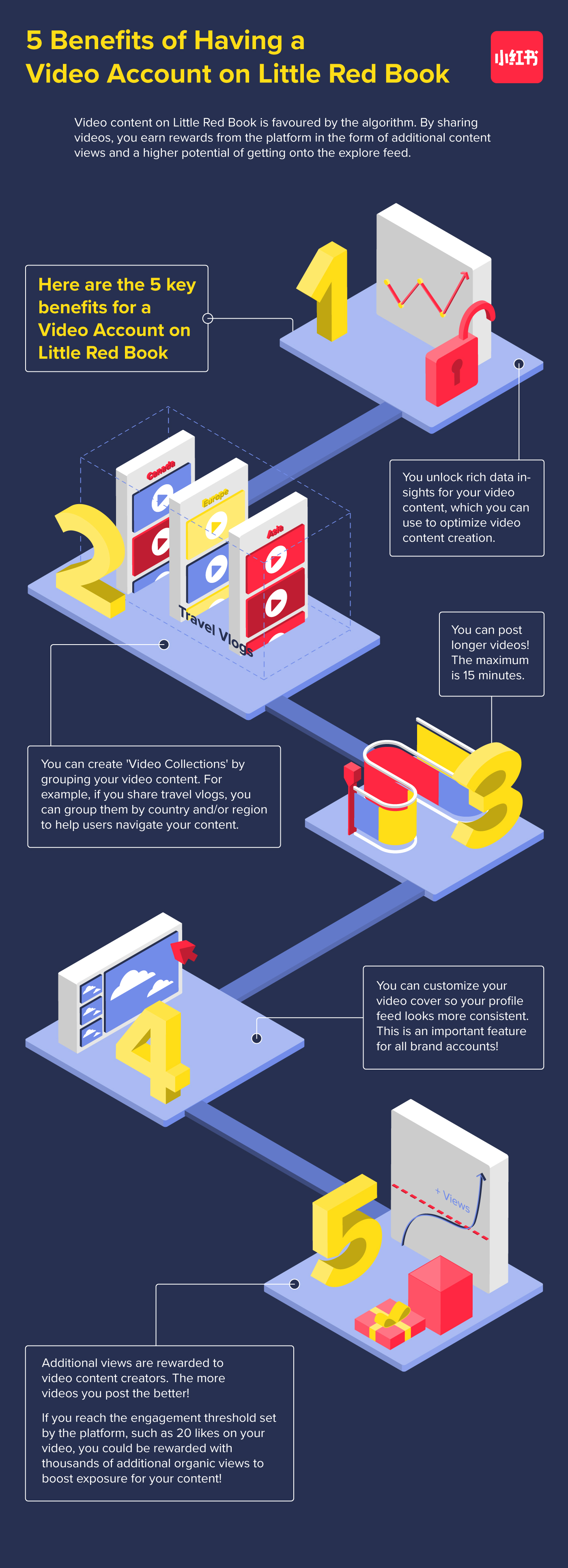
In this assignment, I created an infographic showcasing the 5 benefits for having a video account on Little Red Book. Little Red Book is a popular chinese social media platform where users can post videos and photos carousels. For this infographic, I wanted to show the various benefits and how they differentiate from one another. I used Adobe Illustrator to create simple illustrations and turned them 3D to add dimension and interest on a normally flat format.
Art Installation
The University of British Columbia
Graphic designer, Muralist
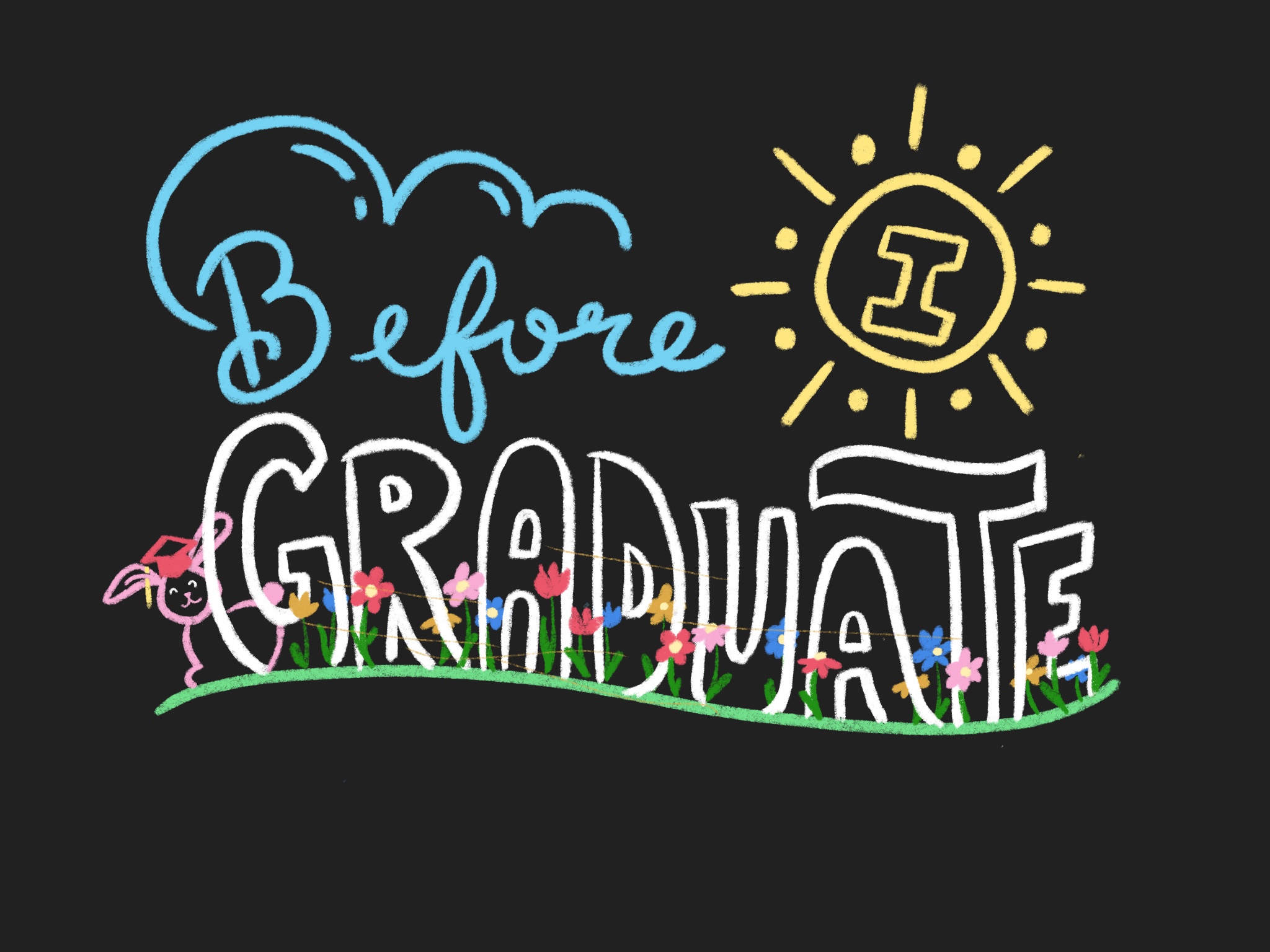
To celebrate graduation, I helped create a chalk illustration on an oudoor blackboard. Students were asked to participate and write around the mural what they wished to do before graduating. Since graduation occurs in spring, I wanted to make it sunny and cheerful for this exciting time. I used different typefaces to add in playfulness and decorated with flowers and a bunny since those are typically associated with spring time.
Initial sketch on Procreate
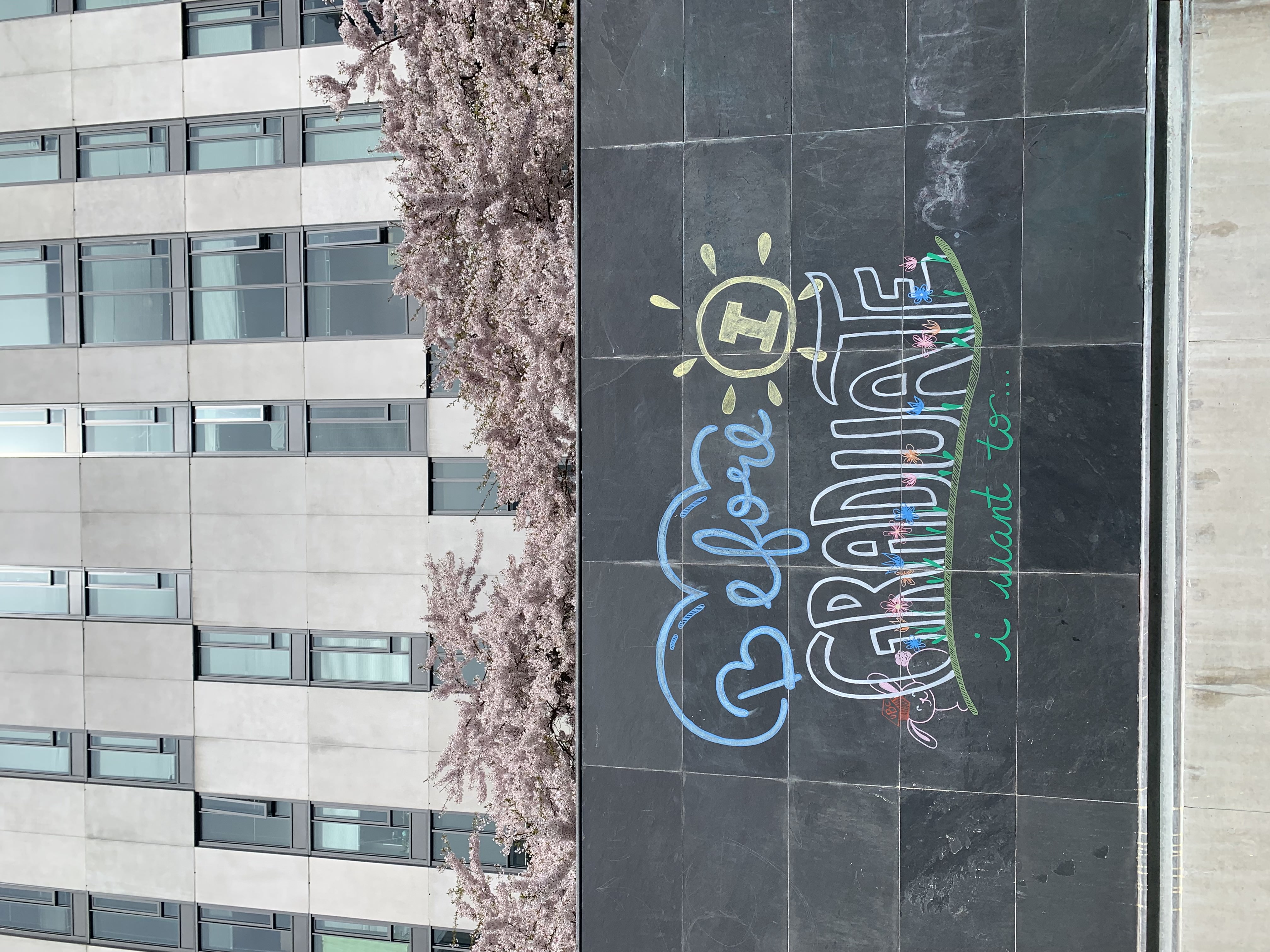
Final drawing on outdoor chalkboard
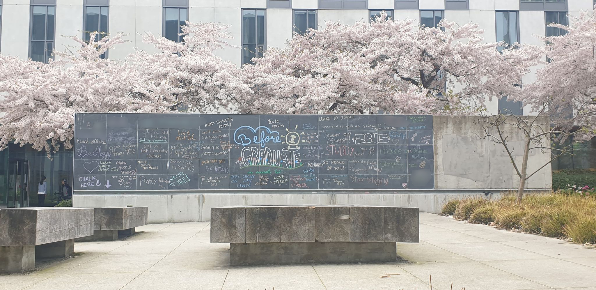
Final drawing with participants answers